

Recently, we did a post on our social media about the checkout process for one of our ecommerce clients, A-One Tools & Fixings. We wanted to break it down a little further…
Checkouts are where intent turns into revenue. A customer has already browsed, compared products, added an item to basket and decided they are ready to buy. At this stage, the job of the website is not to persuade from scratch but to remove friction, answer final doubts and make completion feel simple, secure and worthwhile.
Checkout abandonment remains one of the biggest conversion challenges in ecommerce, and much of it is driven by preventable issues:
- Unexpected costs
- Forced account creation
- Long forms
- Unclear payment steps
- Low trust at the point of purchase
This means that checkout optimisation isn’t just another step in the website design. It requires research, thinking and strategy. It’s a commercial priority to help prospective customers move confidently from basket to delivery.
Let’s chat about some of the essential elements of the ecommerce checkout process…
What do you want to know about?

High-resolution, clean imagery
Clean, high-resolution images help customers quickly confirm that they are buying the right product, variant, colour, size or bundle before they pay. This is especially important in markets where customer confidence can directly affect the final decision. A small, poor-quality thumbnail can create uncertainty, whereas a clear image reassures the shopper that the item in the basket matches the product they chose.
Clean imagery also contributes to perceived professionalism. If a checkout page looks polished, consistent and brand-aligned, the customer is more likely to feel that the fulfilment experience will be reliable too.
We can help you decide what’s best for you: traditional photography or product renders.
Simple CTAs
A checkout call to action should make the next step obvious, and this is where language choice is important. ‘Continue to delivery’, ‘Review order’ or ‘Pay now’ are more helpful than vague labels such as ‘Next’ or ‘Submit’ because they make it clear to customers what comes next. This matters because uncertainty creates hesitation. If a shopper thinks a button might place the order before they have reviewed delivery details, they may pause or leave.
Simple CTAs also improve speed. A strong ecommerce checkout flow should guide the customer naturally through the process, using one primary action per step and avoiding competing buttons, unnecessary promotional links or distracting pop-ups.
Transparent pricing
Few things damage checkout confidence faster than surprise costs. Customers expect to see the full picture before they commit: product price, discounts, delivery charges, taxes, fees and any minimum-spend thresholds. If additional costs only appear at the final payment stage, shoppers may feel misled, even if the charges are valid.
Transparent pricing reduces doubt and helps shoppers mentally approve the purchase earlier in the journey.
Shipping and billing information
Shipping and billing fields are necessary, but they should never feel excessive. Customers want to know where their order is going, when it will arrive and whether their billing details are correct, without being asked for information that feels irrelevant. A well-structured form separates shipping and billing clearly, uses the shipping address as the billing default where appropriate and only asks for essential details.
Good shipping information also supports decision-making. Delivery options should include estimated arrival dates, costs and any cut-off times. If a customer needs an item by a certain date, unclear shipping information may stop them converting. The clearer the fulfilment promise, the easier it is for customers to buy with confidence.
Guest checkout
Account creation can feel like an obstacle at the worst possible moment. A new customer may not yet trust the brand enough to create a password, share extra details or commit to an ongoing relationship. If registration is mandatory, the shopper may abandon even though they were ready to purchase. Because who can be bothered to do all of that?!
The better approach is to let customers complete the order first, then invite them to create an account afterwards by highlighting useful benefits such as order tracking, faster future checkout, saved addresses or loyalty rewards. This keeps the purchase journey focused on conversion while still giving the brand an opportunity to build long-term customer relationships.
Convenient payment gateways
Customers have strong preferences when it comes to payment. Some want to use debit or credit cards, while others expect digital wallets, PayPal, Apple Pay, Google Pay, Klarna or other buy now, pay later options. If their preferred method is missing, the checkout immediately feels less convenient and the customer may decide not to continue.
70% of cart abandonments are due to poor payment experiences. Shocking, but not unexpected.
Over 85% of consumers expect multiple payment methods. Again, shocking, but not unexpected.
The more familiar, secure and flexible the payment stage feels, the fewer reasons customers have to abandon.
Mobile-friendly design
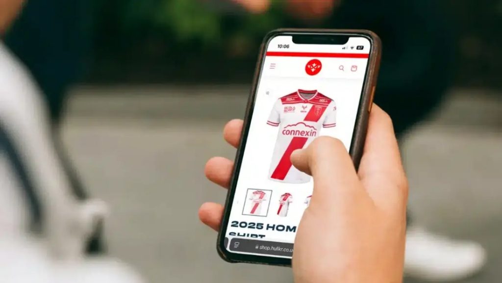
Mobile checkout must be designed for smaller screens, touch input and customers who may be shopping whilst distracted or on the move. It should feel effortless with one thumb, not like a desktop form squeezed onto a phone.
Every extra field, confusing error message or hard-to-tap button has a bigger impact on a small screen.
67% of shoppers prefer mobile-friendly payment options. That’s 67% of potential customers asking for single-column layouts, large tappable buttons, readable text, minimal typing, fast load speeds and clear progress cues. Oh, and no annoying popups that take up the whole screen and are impossible to get rid of.
Returns policy
A clear returns policy reduces purchase anxiety. Before paying, customers want to know what happens if the item does not fit, arrives damaged, looks different from expected or is no longer needed. If the policy is hidden, unclear or full of conditions, it can make the purchase feel risky.
Checkout is a powerful place to summarise the key return terms in plain English, with a link to the full policy if needed. Phrases including ‘30-day returns’ or ‘free UK returns’ signal reassurance without distracting them from completing the order. Returns clarity can be the final nudge that turns hesitation into purchase.
Autofill
Autofill is one of the simplest ways to reduce checkout friction. Address lookup, browser autofill, saved card details and postcode search all reduce the amount of typing required from the customer. This is particularly valuable on mobile, where manual entry is slower and mistakes are more common.
When forms recognise saved details and guide customers through the fastest route, the checkout feels intelligent, modern and respectful of the customer’s time.
Trust signals
Trust signals are essential at the checkout point, because it’s where customers share sensitive information. Security badges, recognised payment logos, customer review snippets, guarantees, delivery reassurance, contact options and clear brand details can all help reduce uncertainty. These cues are especially important for first-time buyers.
The best trust signals are placed close to moments of hesitation, such as near payment fields, delivery choices or the final order button. They should be genuine, relevant and unobtrusive.
Around 49% of customers won’t purchase if security is a concern. It’s your job to make sure they’re reassured and comfortable.
Why every detail matters in the ecommerce checkout process
A strong ecommerce checkout is built from many small details working together. Even small details that may not seem significant at first glance.
But put yourselves in the shoes of a new customer.
Can you be bothered to create an account for a brand you’re just trying to buy a £3.25 silicone smoother from?
Are you sure you can return the shoes you’re planning to spend £149.99 on? Will they actually fit (and look nice because you’re pushing the boat out with bright pink trainers this time)? Can you return via InPost, because of course Royal Mail isn’t open when you get home from work?
You just want to quickly buy something, not spend 10 minutes telling the brand your life story.
For ecommerce brands, checkout optimisation should be treated as an ongoing conversion strategy rather than a one-off design project. The easier, clearer and more trustworthy the process feels, the more likely customers are to complete their purchase and return in future. Reduce friction for improved conversion rates, guaranteed.
Chat to us about optimising your checkout process: [email protected].

