Background
After previously working with FLX to develop their FLX Health app, we were approached for some general dashboard updates after the app launch and customer feedback. FLX wanted to refresh the design and aesthetics, as well as modernise the app and add deep insights into the musculoskeletal health of the client’s users.
In this case study, we discuss the main objectives for the project, as well as the process and outcome, including how our team managed to modernise the FLX dashboard and provide better insights on data and usage.


Objectives
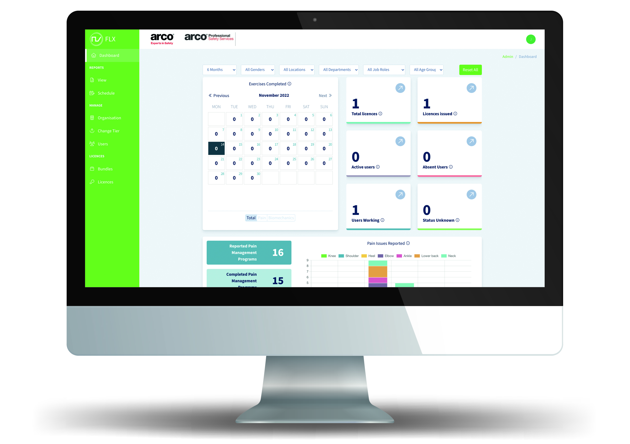
The main objectives of the project were to build on the general functionality and make the dashboard more informative as well as run detailed reports on use and issues spotted. FLX wanted to add and improve graphs to show data in a more understandable format, as well as add data filters. Previously, there had been no way to filter data and so it was difficult to analyse information coherently.
After a brief meeting with the client, we understood they wanted to really capitalise on data analysis as well as enhancing the aesthetic features of the app. FLX’s partner, Arco, gave feedback on the app which prompted these updates; they want to better understand the risks of musculoskeletal issues and attempt to mitigate any issues posed.
Process Part One
One of the primary objectives of the dashboard updates included adding in filters for data analysis. Department, location, job role, age group and time periods are some of the filters included, allowing for better data collection and analysis. Adding these filters allows for admins to track the efficiency of the app and see where it is being used best. We also carried out some background work on the API to put together updates to feed information into the database with the correct filters. This further encourages admins to collect data and manage the app usage and efficiency.

Process Part Two
Another part of the dashboard updating process included giving the admin panel more control over user profiles, which includes editing to set their job roles and locations etc.
One of the main additions to the app included the introduction of reports. We included a pre-set of 18 reports to show outcomes including the amount of absent (sick) workers utilising pain management programmes. As well as this, there is also the ability to create custom reports which allows admins to choose their own data points and therefore create more specific reports. These can be downloaded in a realtime CSV format, or scheduled to be emailed at any time.
Outcome
FLX were very happy with the updates, giving them more visibility of users and their data. The updated dashboard allows the creation of reports through better filtered data, improving the efficiency of data collation and analysis. Professional performance metrics are now used more effectively alongside data management to analyse usabilty of the app and how effective it is in reducing absenteeism through biomechanical exercises and pain management.
Our work on the FLX Health app is ongoing and we continue to work alongside the team to update the app in accordance with user feedback and industry trends. Gamification and the implementation of augmented reality are the next objectives in our work on the FLX Health app so keep your eyes peeled!
