If you hadn’t noticed, the World Cup is upon us (given the time of year, we wouldn’t be surprised if you’d forgotten). With the start of the tournament, we wanted to discuss the evolution of the tournament branding throughout the years. One of our designers and animators, Will Garman, delved into historic and modern branding to bring you this insight…
Due to there being a ton of past tournaments, to keep this insight nice and snappy, I’ll be breaking the article down into ‘eras’. Doing it this way will also capture the stylistic choices of the era.
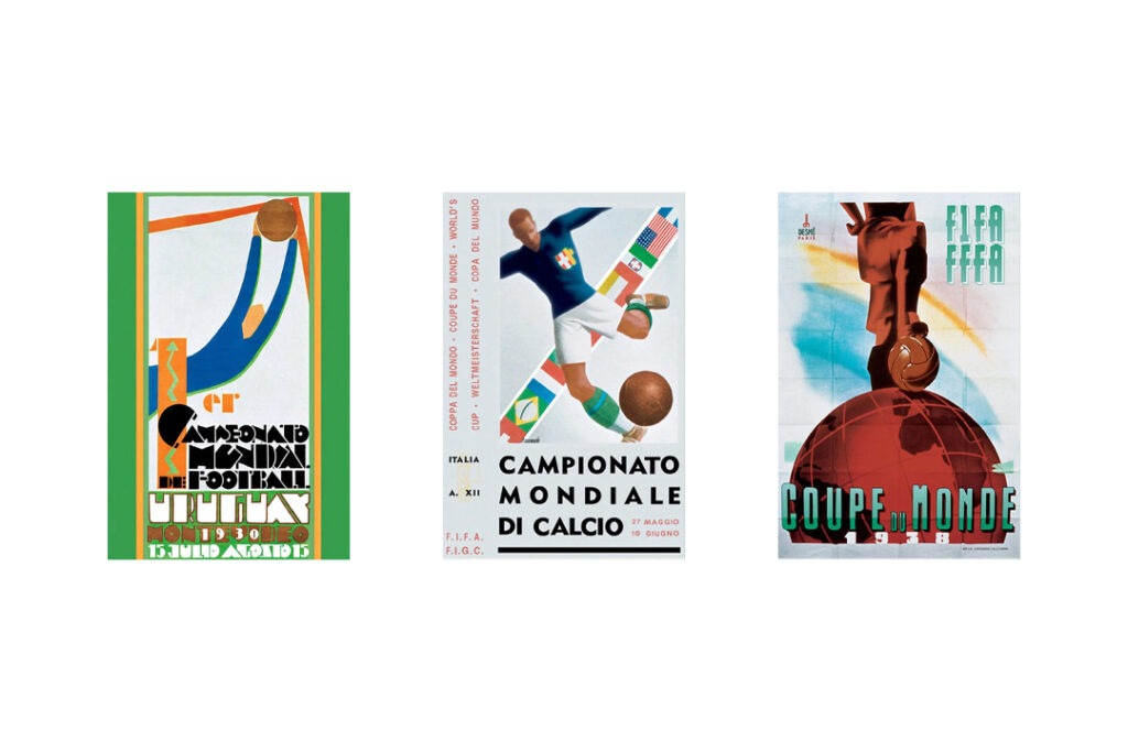
Pre-World War 2
Compared to modern logo trends, the first three tournaments have extremely busy icons/branding, but what you have to understand is that at that point, the World Cup wasn’t really a ‘World Cup’ per se. It was a much smaller event with no Asian or African nations involved and the way of marketing the tournaments was limited.
The tournament wasn’t a global phenomenon at this stage, so the marketing options probably relied largely on a localised poster campaign. TV was also in its infancy, again limiting the brand’s potential for growth.
Through this lens, we can start to understand why there’s a high level of detail, focus on local language and a general lack of focus on the host nation.
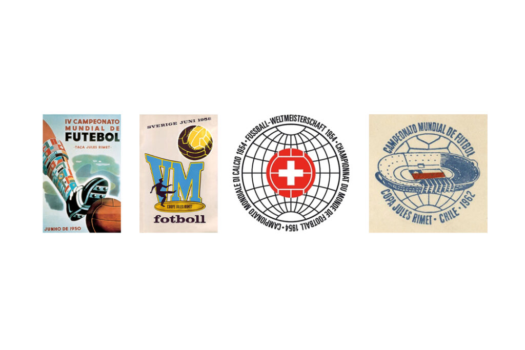
Post-World War 2 – 1962
Similar to the pre-war era, these tournaments still follow a poster format (with the exception of the 1954 Swiss hosted World Cup). This could be for a couple reasons – firstly, while the tournament was continually expanding in popularity pre-war, the tournament went on hiatus during the war. This break and the fact that the tournament was still a new thing, stunted its growth a little, limiting its reach and affecting the avenues in which to advertise it.
With this, and potential budgetary limitations after the war, the tournament was starting up again in every sense of the word and this probably plays a large role in the more poster-esque designs in the earlier years of the era.
That said, 1962’s Chile hosted tournament perhaps shows the start of a transition to a logo-type design. A design that not only focuses on the host nation, but perhaps one that might be broadcast around the world?
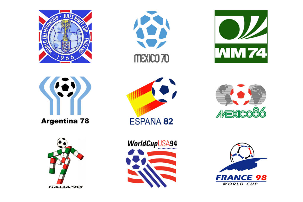
1966-1998
Whilst TVs were still a new novelty in the 60s, they boomed throughout this era. This era covers a large portion of the tournaments, but I think the design variations show a similar focus, with continual refinements to a formula that shows off the host nation.
There’s a big focus on the host nations flag, whether it’s direct use, colourways or localised cultural design – there’s a concise design language to them. This works well for TV as an audience can understand at a glance, where and who is hosting the latest tournament.
Going into the later years of the era (1986), we can start to see designs that could influence TV intros and idents too. And in general there’s more of an understanding of how the logos can be used beyond TV, as we move into the era of merchandise and football’s more modern commercialisation.
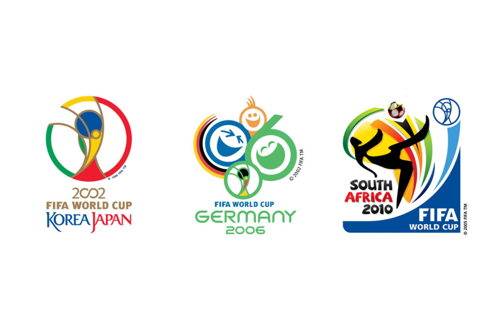
2002-2010
Continuing a more broadcast friendly design language, this era follows a similar story to the last. This is largely due to the mass distribution of consumer internet. Adding a further dimension to how hard a logo has to work across mediums, the logos seem to adopt a consistent emblem of the World Cup and (with the exception of 2002, held in two countries) the host nation’s flag.
While the design language still leaves a lot to be desired for the ever evolving digital world, predominantly because they all have incredibly fine details (could you imagine them as a favicon?!). The logo design looks fun and sells FIFA’s festival of football. They also work well for commercialisation on stuffed toys, t-shirts, caps and authenticity holograms – oh and don’t forget, they still work really well on TVs!
Modern Era
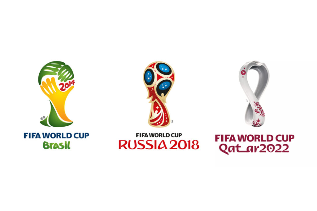
This era starts a new trend, with the internet, apps and all things digital penetrating our everyday lives – the logos from 2014 onwards, have a clear strategy. The design language has clearly learned lessons from all the past eras, keeping things simple and digital first.
Firstly, they all follow a basic shape of the iconic World Cup Trophy (introduced in 1974) design. The designers have then sprinkled in colours and cultural design influence of the host nation, whether it’s the fun of Brazil, Russian folk design or the Arabic sensibilities of Qatar. The logos show at a glance who the host is, as well as being scalable to different dimensions, both digitally, print and commercial products.
Some might think these logos are sterile in comparison to the past eras, but after writing this insight, I think I’ve come to appreciate that the design language has learned from past eras and had to adapt and evolve to an ever changing cultural and media based landscape. I also think the limitations around the basic structure of the logos centring around the trophy allows for a design challenge, especially given that 2026 will be hosted by 3 nations. I guess time will tell what the next era will bring!
Our team of creators, designers, animators and marketers can help you expertly design and craft your branding, and bring your visions to life! Get in touch today for a consultation!

