Infographics give brands the opportunity to be creative whilst communicating potentially complex data in a visually enticing manner. In the case of healthcare, infographics are able to remove the clinical barrier and make information more accessible and available to understand.
We discuss 3 of the best healthcare infographics and what it is that makes them great!
1. Addressing Misconceptions
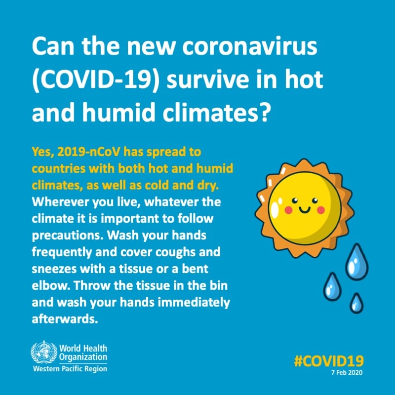
Addressing misconceptions – or mythbusting, if you will – is one of the biggest objectives for healthcare providers, especially those situations with high publicity or media coverage, such as Covid. The emergence of the Covid-19 pandemic in 2020 saw the spread of misinformation and worry. Because of this, we think this infographic is one of the most effective in not only dispelling misinformation, but also providing trustworthy, reliable facts.
2. Public Service Announcement
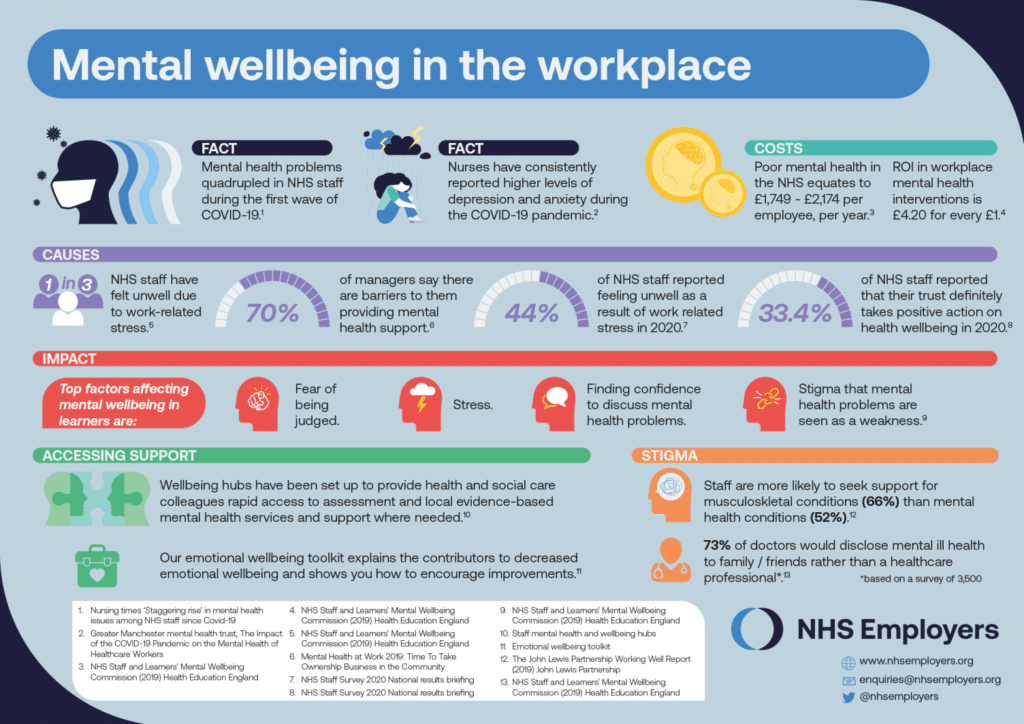
Public service announcements are so important in healthcare to provide patients, and the public, with reliable information and advice. Often, healthcare facts are quite stark so being able to communicate the information in a more informal tone is key. These types of infographics, such as the one above, are packed with information but the use of colours and layout, and the contrast of text to images, makes the infographic more accessible and visually enticing.
3. Innovation
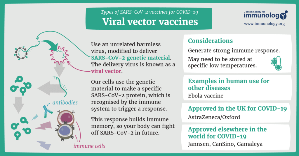
Healthcare infographics have many different objectives, but the key to achieving them comes with the use of colours, text and imagery. Being able to create an informative, creative tool is key to communicating accessible information to the public.
We can help make high-quality graphic designs that communicate with your audience. Our talented team are creative, friendly, and always happy to help. So, if you need healthcare infographics, get in touch!

